Technical Data
Total area: 187 sq.m.
Area open to public: 152 m
Correlation between area opened to public and total area: 81%
Exposition: 58 ml
Project
The customer Svetnaya (what in English stands for ” color ”) is one of the largest pharmacy chains in Kazakiztan. Its always expanding network includes fifty pharmacies in nine cities around the country and covers 8% of the local market. Its mission implies creation of New Generation pharmacy of the European level, with modern sales techniques and where one can easily receive the best professional advice .
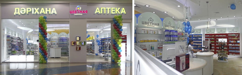
For the pharmacy in Aport Mall in Almaty Sartoretto Verna worked out a special rebranding campaign of the chain having analysed its location, structure, communication and merchandising sector. The notion of “Services” was newly introduced there. Moreover a special training was held in Rome for the managers of the pharmacy. Experts of the pharmaceutical and make up industry took part in it. Implementation time was really fast; only two months passed from the project presentation in Rome till its inauguration. The expected delivery date was observed. The project “Aport” is a part of restructuring of the entire chain which includes, besides this, the realization of another pilot store that will soon be opened in a new shopping center Mega2, destined to become the largest shopping center in Central Asia.
Sartoretto Verna concept for Svetnaya pharmacy
The pharmacy chain Svetnaya is characterized by modern look, vivid and rich colors. According to the traditional values of the brand, the pharmacy must take care of health and beauty of its customers,it must offer simplicity and accessibility.For that Sartoretto Verna developed a new detailed concept. The pharmacy can boast amazing design with glass décor and aluminum, diffuse but not invasive light, clear communication and marketing space . The goal is to create an atmosphere where the client feels at ease but at the same time the client is stimulated and distracted from the monotonous shopping, what gives him a unique experience. According to Sartoretto Verna vision ” the environment is not only the visual component, it is also sensations which can be conveyed only after living the place apart from only seeing it”.
The logo in Aport pharmacy is implemented in the shape of flower chain. There is a special place for consultation and prevention services at the center of a room, which is situated under the starry sky with golden light premarin medication. Two series of displays representing the petals are arranged inside and outside the circle. The customer can walk freely in the pharmacy but still the entire pharmacy cannnot be seen, the client has the pleasure to discover new products and corners. A single color associated with the colors of the logo was attributed to each commodity according to a special scheme which will be applied to the entire chain. Such a system gains public loyalty: consumers have an incentive to come back to the pharmacy because they can easily find the products in each drugstore of the chain thus becoming habitual customers.
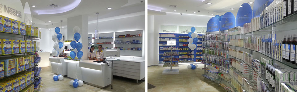
Two single- seat counters were placed at the entrance and represent a welcome area. For the first time the custode here is no longer at the mercy of the product, the client is informed and helped to choose. A professional team is always at client’s disposal, in addition to that there are specialized areas for consultations, care and beauty treatments. Welfare is the common goal for Sartoretto Verna. A pharmacy which cares about all this increases its profits because consumers buy from the one who is able to provide a precious piece of advice.
A thorough study was made in order to improve the window and sign of the pharmacy, so that to take advantage of the great location of the pharmacy in a mall just in front of a store with high attendance. To attract customers the window is completely transparent that gives the possibility to see the interiors of the pharmacy which seems incredibly deep thanks to the special layout; the ceilings and bright colors of the furniture make the place visible from the half way. The result is an increase of impulse customers.
A few days after the beginning of October the flow of visitors in the shop defenitely increased.This concept worked out by Sartoretto Verna is already a success, which only strengthens original image of the brand Svetnaya, approved by its customers and helping to increase sales.
Description
The pharmacy appears to be spacious , neat , bright, it is a place devoted to health and wellness. Sales area starts from 2 single- seat counters Ral System 2 with white sky ceiling which is situated in front of the entrance. The wall exhibition is provided by Ral System 3 lacquered panels made in blue , fuchsia , red, white , yellow and green (the colors of the logo Svetnaya )and depend on various sectors. The names of the brands are written on the white tympanum. RalSystem 2 shelves with colorful tympanum host the rest of the commercial offer. The ethic sector includes two counters Oliver made in white sky with inclined front part and led light; behind the counter one can find white lacquered panels to expose the goods. Another counter was also put in this area and in future it will be designed to offer soft drink to the clients like it was in the old times.LED light gondolas worked out for temporary promotions complete the pharmacy furnishing.
The choice of high quality furnishing produced in northern Italy was made due to the ease of installation and transportation .
The central part has a large private counseling area. The Baby sector includes an area for playing, which is very popular among families visiting the mall so that they can devote themselves calmly to shopping .

What does the Group say?
Sergey Vartan, CEO and Development Director of the pharmacy chain Svetnaya , and Alexander Reshetov , Quality Director , explains : ” We chose Sartoretto Verna to carry out the project of our new drugstore because we wanted it to boast a modern design and technology. Aport is one of the largest and most popular shopping malls in Central Asia, our aim was to open a new pharmacy brand that could impress and conquer the hearts of our customers. The furnishing provided fits perfectly the design we wanted. Our plan of dividing the pharmacy in commodity areas is based on the principles of merchandising and layout of Sartoretto Verna .” According to the managers of Svetnaya, the chain needed to improve communication and category management. Architects of Sartoretto Verna can eaily realize their ideas, they have a wide range of knowledge and their services are not limited only to counseling. They have completely reorganized the merchandising sector. ” Every stage of the work , starting with the presentation of the concept to the furnishing installation was carried out on time and with excellent quality ,” said the manager.
The comment of customers
According to reports received from the staff of the pharmacy, customers are satisfied with the product positioning and the ease with which they walk in the pharmacy. People are just impressed by lighting and variety of colors.


